Porto. City identity
—
In June of 2014, White Studio was invited to design the new identity for the city of Porto and its city hall.
The city needed a visual system, a visual identity that could organize and simplify communication with the citizens and could at the same time define a clear hierarchy, bringing together the city and the city hall. We needed to represent Porto, a global city, a city for everyone.
That city could never be a mere geographic location, restrained by physical boundaries. It is filled with life, with character, with icons and symbols, with habits and ways of living, with landmarks and landscapes. It could not be summed up in a few buildings. It is alive, and its identity should be able to portrait that life, that constant growth.
Ancient, Very Noble, Always Loyal, Undefeated City of Porto.
Porto is a very passionate city. Here we feel cozy, we feel at home. We develop a feeling of ownership with every landmark, with every street. The city is ours. And with each step, we recognize its accent and its attitude.

This idea of ownership felt very important for us. This unique home that each one of us finds
in the city needed to be represented. Everyone should have their own Porto.
With this idea in mind, one of our first tasks was to understand how others view the city, and what comes out of that observation. It’s obvious and even cliché to identify the big icons like Torre dos Clérigos, Casa da Música, Ribeira, Fundação Serralves, the river. These icons go from the incredible gastronomy to the unmistakable accent of the north of Portugal. The Port wine, the São João festivities, the old and the contemporary, the landmarks and the familiar, the list of “Portos” continues.
For each citizen, Porto represents a different thing. If you ask someone “What is your Porto?”
the number of answers is endless. We felt like we needed to give each citizen their own Porto.
We needed to show all the cities that exist in this one territory.
Thus it became clear to us that Porto needed to be much more than a single icon, much more than
a single logo. It needed complexity. It needed a life. It needed stories. It needed personality.
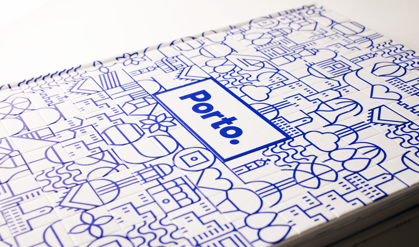
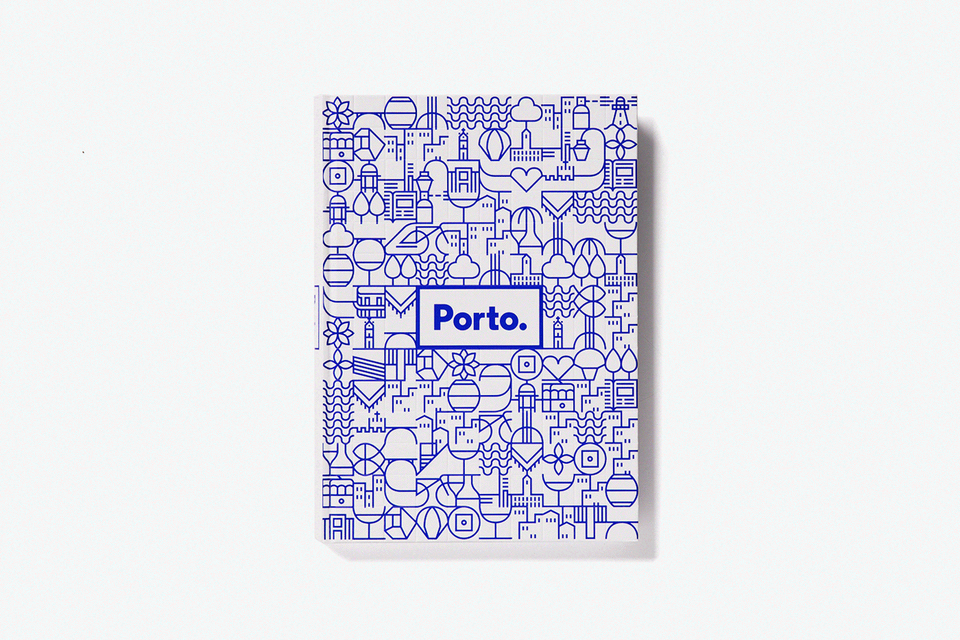
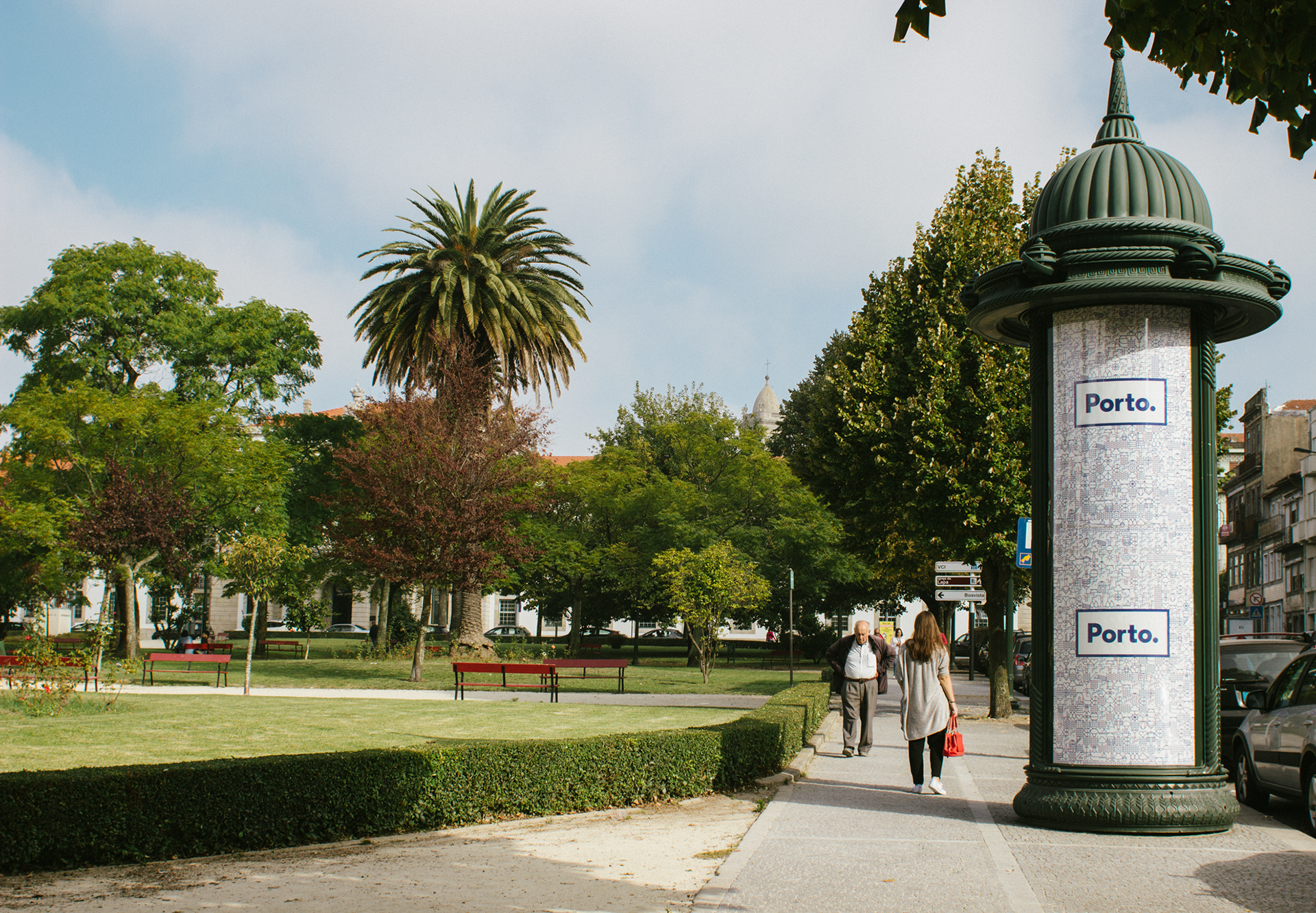
Looking at the aesthetics of Porto we found the inspiration we were looking for in the blue tiles spread all around the city. Although the city is known for a wide range of colorful tiles, with patterns and drawings that go from the totally geometric to the fully illustrative, only the blue tiles were used to tell stories. The blue tiles show our history, talk about the city and its landmarks, they are narrative by nature.
Inspired by the stories in the tiles we developed more than seventy geometric icons that represented the city and its people.
The icons were designed based on a grid that could connect them with each other, creating a continuous network that evokes a tile panel. These icons became a visual code to represent the city. A code that can live by itself, viewing each symbol individually, or as a network of symbols that show the never-ending complexity of our city. The icons could also be more illustrative, telling stories, showing the landscape, translating our passions.
Porto is a city with a strong personality. It has a recognizable attitude that is unmistakably ours. So living along the network of symbols, we needed a brand with a clear message, one that summed up our identity.
The word was enough. In a simple direct affirmation of who we are and what we are. Nothing else but Porto. The city is undisputed, unavoidable, incomparable. It’s Porto.
In the word, in the dot, we visualize the orality of the city. As if the attitude of Porto was just waiting to be revealed. It is the blunt affirmation of what we are.


One of the things we realized when designing the icons was that the list of things to represent was endless. To each person we talked to, a new possible icon came up. The list kept growing from an initial twenty icons to the current seventy and counting.
It is meant to be an open system. Through suggestions, drawing panels and interviews we are trying to collect as much input as possible, and every week a couple of new icons appear.
We hope we can make this identity feel as much like home as possible to the citizens of Porto. We want it to be theirs. Their ideas and their participation will be taken into account and we’ll build these stories together. Porto is a shared identity. It is not meant to be done or closed. The openness and versatility of this system allow the identity to reveal its various stages of maturity, to grow and to develop in a dynamic, mutable environment. Our ultimate desire is that the identity can work for each Porto citizen, that they can relate to it and find themselves in it. In the diversity of the symbols, we want to find unity.
For Porto.
—
Client: Porto City Hall
Studio: White Studio
Year: 2014
Art Direction: Eduardo Aires
Design project: Ana Simões, Raquel Rei
Designers: Raquel Rei, Ana Simões, Lucille Queriaud, Joana Mendes, Maria Sousa, Dário Cannatà
Studio: White Studio
Year: 2014
Art Direction: Eduardo Aires
Design project: Ana Simões, Raquel Rei
Designers: Raquel Rei, Ana Simões, Lucille Queriaud, Joana Mendes, Maria Sousa, Dário Cannatà