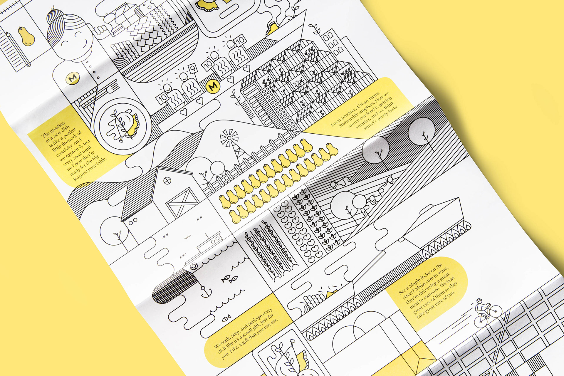
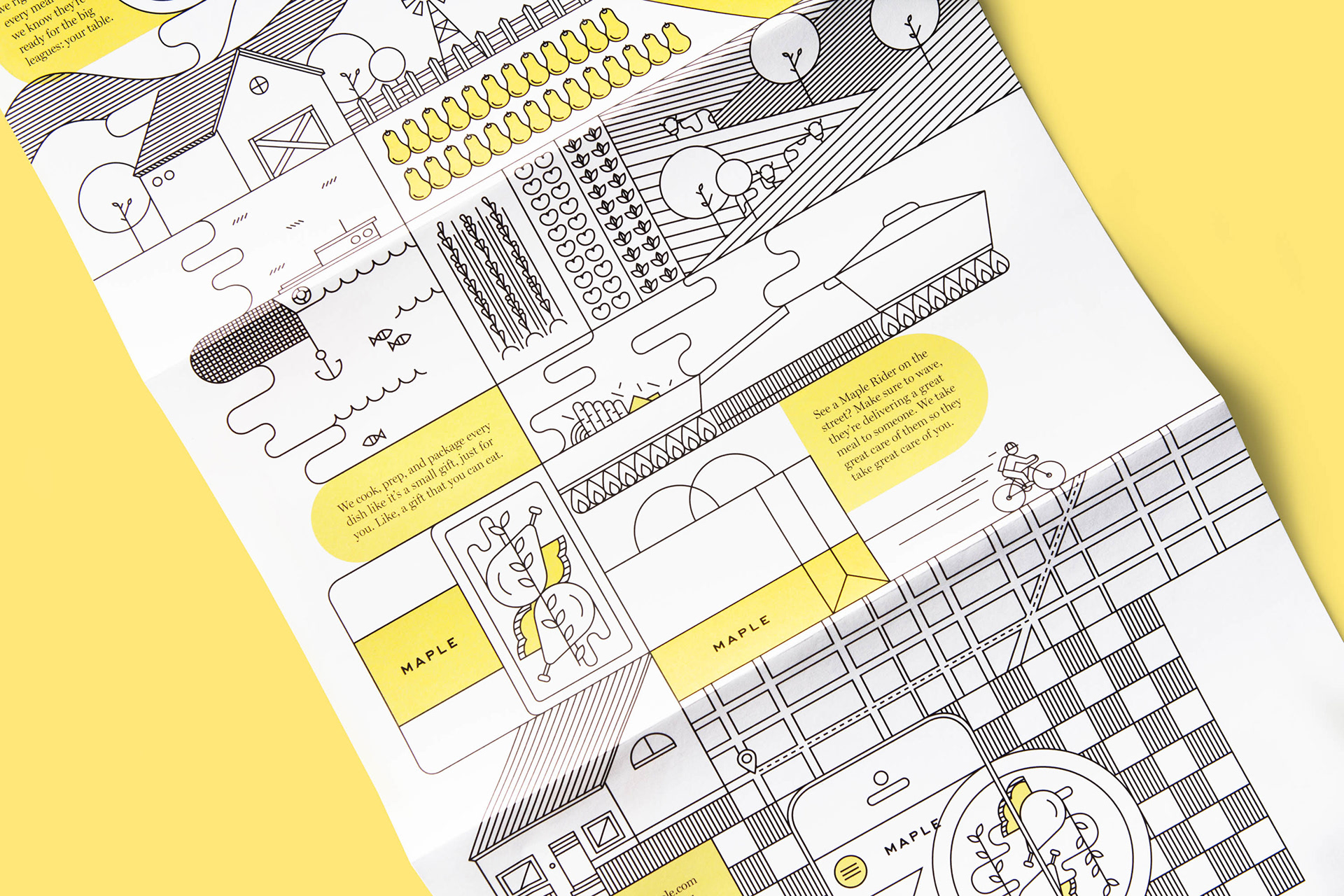
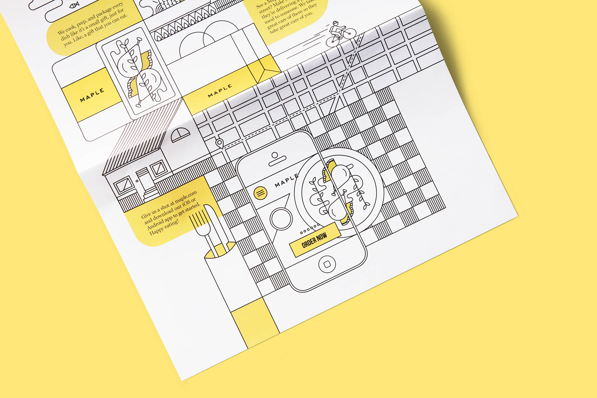
Maple & where it all comes from
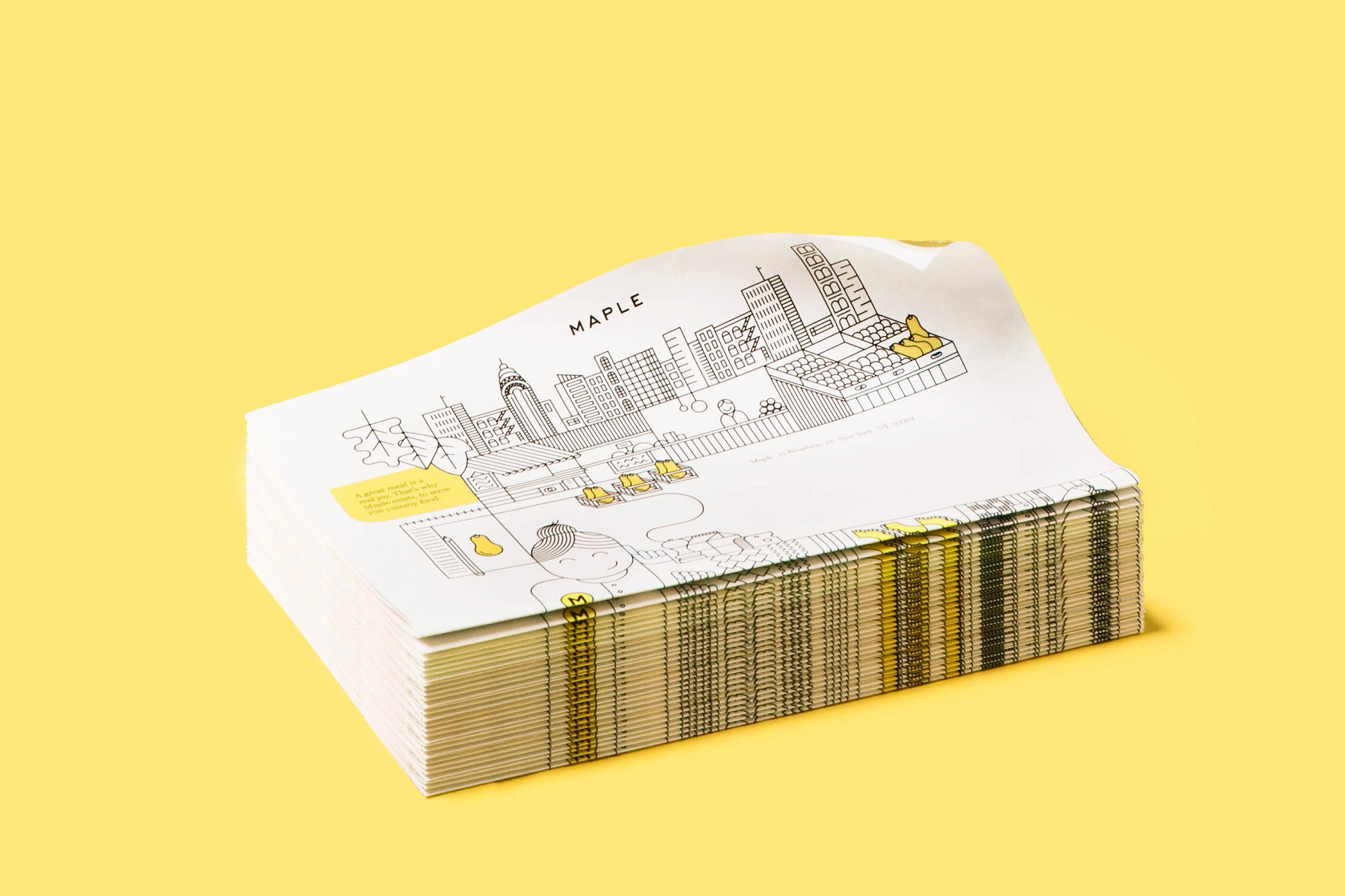
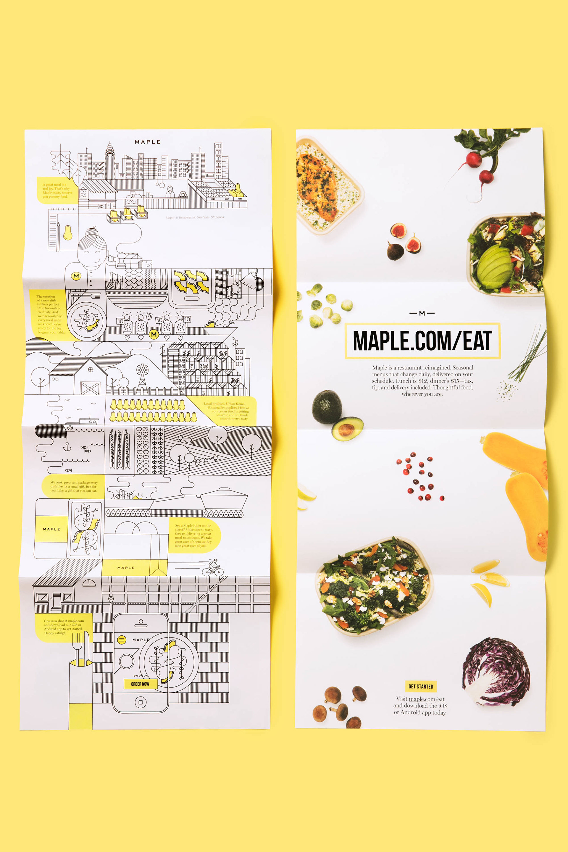
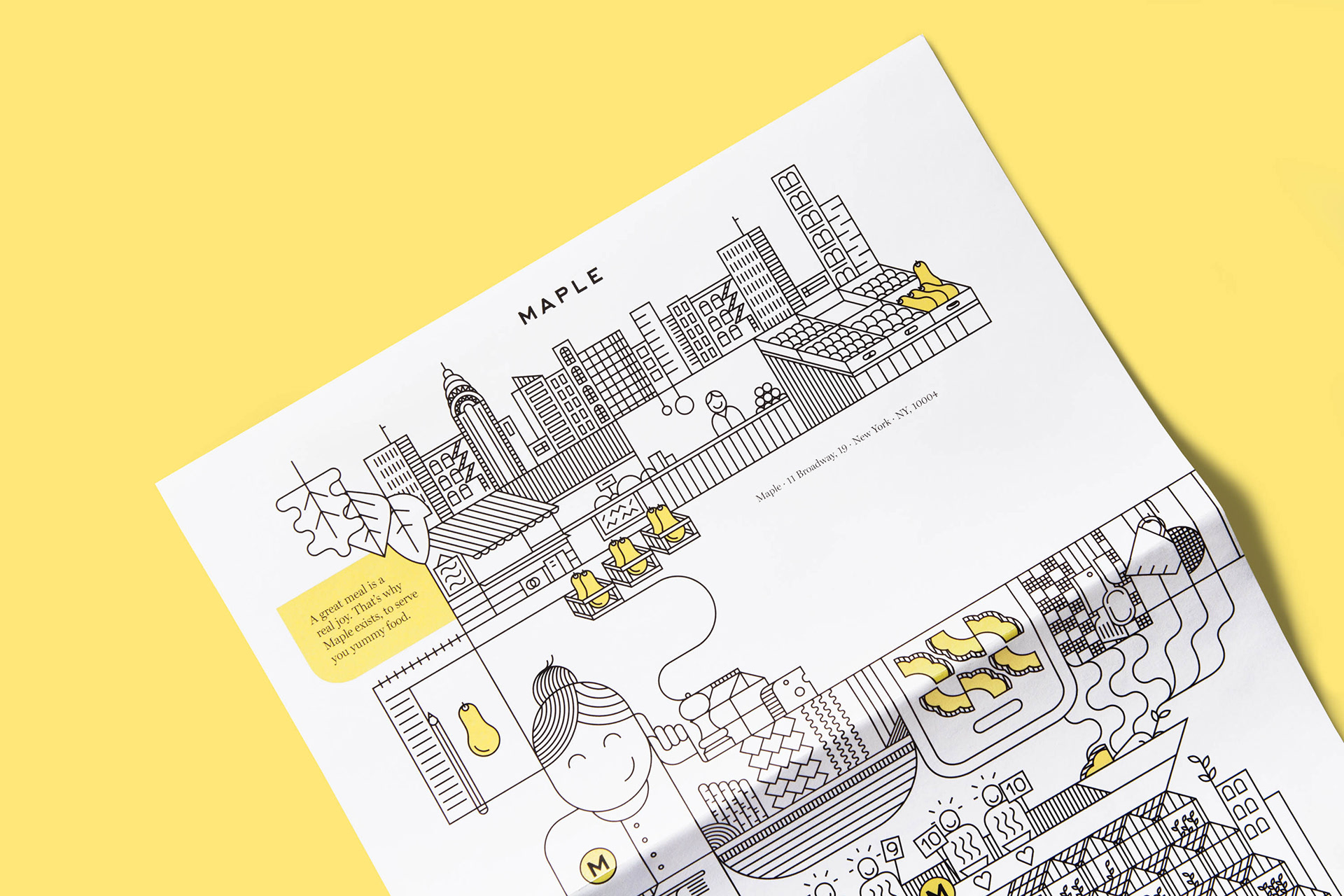
Maple introduced itself to Downtown Manhattan with this printed piece—both in the mail and with each order. The assignment was to differentiate Maple from its food delivery competitors in NYC.
So this piece rendered the start-up’s full, vertically-integrated story, every step of the way—from a dish’s inspiration, to sourcing ingredients, to testing recipes, to internal feedback, to a customer’s phone, table or desk. The illustration told the full story, leaving no symbiotic step to chance.

Client: Maple
Creative Direction: Greg Hathaway
Graphic Design: Ana Simões
Photography: Kate Izor
Year: 2015