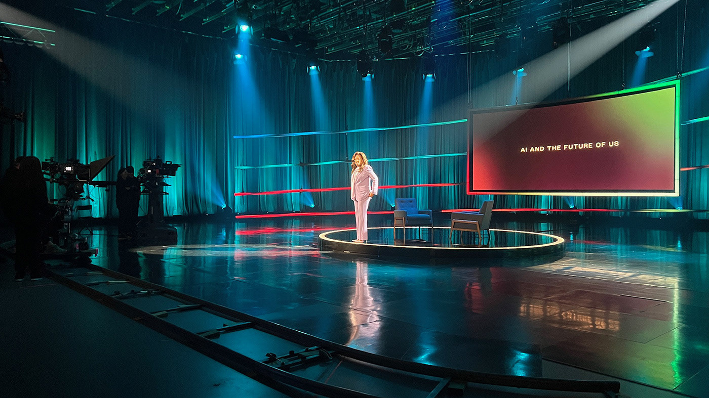
This project represented the Gulbenkian conferences on Ageing and Social Innovation.
Beginning this project, our main concern was to talk about the subject without prejudice or any preconceived ideas about what ageing is. It was important to develop a graphic image that was positive and strong.
The skin metaphor became central to the whole idea. We designed a pattern similar to the small wrinkles that form in our skin as years go by. This ageing pattern was also a synonym for interconnection, communication and partnership, all connected to the social innovation addressed in the conferences. The strong yellow pantone was the second element that binded the identity all together, giving this project the strength and freshness it needed.
Studio: White studio
Client: Fundação Calouste Gulbenkian
Year: 2012
Art Direction: Eduardo Aires
Design: Ana Simões, Raquel Rei
Photography: Álvaro Martino
Client: Fundação Calouste Gulbenkian
Year: 2012
Art Direction: Eduardo Aires
Design: Ana Simões, Raquel Rei
Photography: Álvaro Martino
Thank you!
