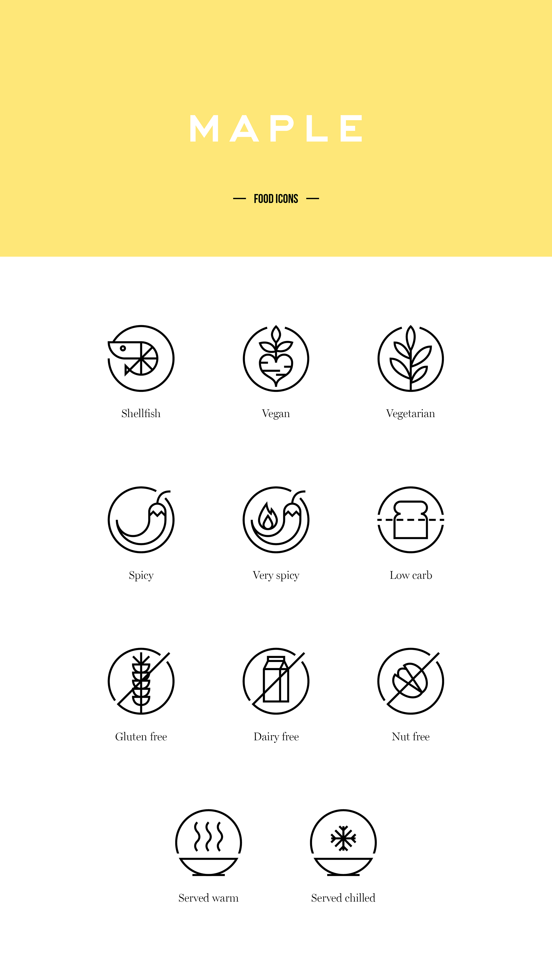
Maple is a food delivery company focused on providing the best possible food at a fair price,
to the busy people of New York.
to the busy people of New York.
One of their main concerns is keeping their costumers well informed on what they’re eating.
So I was asked to develop a set of icons for the brand, to use in the app and on the web,
to better describe potencial risks and contents of each dish.
So I was asked to develop a set of icons for the brand, to use in the app and on the web,
to better describe potencial risks and contents of each dish.
Taking into account the use and placement of these icons on the layout, having to work alone
or in a group, in a white background, each icon was developed as a small circular button.
The circle creates the rule to unite all the icons with small breaks at the diagonals.
or in a group, in a white background, each icon was developed as a small circular button.
The circle creates the rule to unite all the icons with small breaks at the diagonals.
Visit maple.com for more information.
Or download the app.

As a promotional asset we also created a small pattern with the icons.

Client: Maple
Creative Direction: Greg Hathaway
Graphic Design: Ana Simões